
Health and Wellbeing X AI
ROLE
Product Designer
TIMELINE
Feb 2025 - Jul 2025
TEAM
- •4 Engineers
- •2 UI/UX Designers
- •Project Manager
- •Cyber Security Analyst
SKILLS
- •User Research, AI & Features Ideation
- •Design Process & Collaboration
- •Illustrations & Visual Design
- •Prototyping
OVERVIEW
Genesis: Origins & Expansion
myMedicines began with a simple but urgent reality: access to genuine medication across many African communities was fragmented, unreliable, and often out of reach.
From its inception on October 1, 2017, the platform focused on bridging this gap, building an offline network that connected pharmacies to authentic medication supply, laying a trusted foundation and gaining early recognition from local publications and Google-backed initiatives.
In July 2020, a pivotal shift emerged as Nigeria introduced online pharmacy certification. This unlocked a new layer of opportunity. While offline systems held strong, a growing demand for seamless digital access revealed a clear divide, one we saw as a chance to create a more accessible, user-controlled way for individuals to get the medications they need.
OUR DEVELOPEMENT PROCESS

Discovery
- •We kicked off by meeting with business stakeholders to grasp the core idea.
- •We crafted questionnaires and surveyed offline customers to gauge their pain points and aspirations, setting the stage for direction.

Defining
- •We analyzed all insights, user pain points, business goals, and survey data.
- •In collaborative roundtables and whiteboard sessions, we redefined the problem, updated the PRD, and pinpointed key features.

Designing
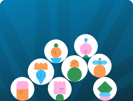
- •As a trio of designers, we built mood boards, design systems, and personalized avatars.
- •I led the branding, illustrations, and the app's visual language, ensuring a unique, user-friendly flow.

Testing & Delivery
- •We conducted rigorous internal and external tests using structured Google Forms.
- •With each round of feedback, we refined until it fully aligned with both business goals and user needs, then we launched.
RESEARCH
Researching the E-Health landscape
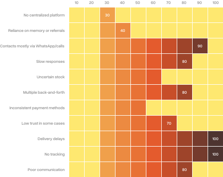
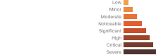
We began by aligning with the business and engineering teams to uncover the real challenges in medication access, mapping key friction points across the current journey.
This exploration was grounded in a rapidly evolving landscape. Nigeria's digital health market is projected to reach $631M by 2025, growing steadily toward nearly $1B by 2030, while health e-commerce, though still underpenetrated at 5–10%, is expanding at 20–25% annually.
Building on these insights, we analysed competitors across Nigeria and Africa to identify gaps and opportunities. We then validated our direction with existing users, confirming interest in a digital solution and prioritizing features that directly address their needs.
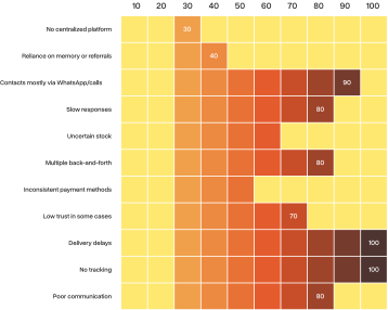

Building on these insights, we analysed competitors across Nigeria and Africa to identify gaps and opportunities. We then validated our direction with existing users, confirming interest in a digital solution and prioritizing features that directly address their needs.
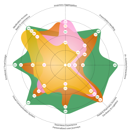
We evaluated key pharmaceutical and health-tech players across Nigeria and Africa to understand how existing solutions address core user needs. This analysis helped identify areas of parity, gaps in experience, and opportunities for differentiation, shaping how myMedicines positions itself beyond standard offerings.
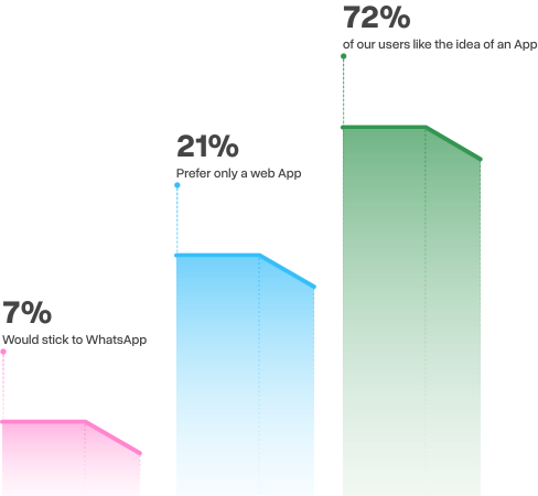
Survey results showed strong openness to a mobile experience, with 72% of users willing to adopt the app, validating the shift from manual channels to a more scalable digital solution.
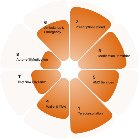
Users selected the features most valuable to them from a broader set, helping identify and prioritize the core functionalities that shaped the product direction.
SOLUTION
The Making of myMedicines Mobile App
With clarity on the problem and direction, we moved from insight into execution.
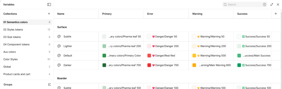
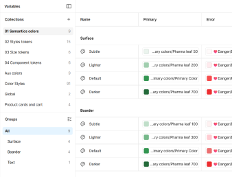
We started by shaping the visual tone, building moodboards to explore how the product should feel. From there, we developed a design system that could hold everything together, across mobile, web, and admin.
Every element, from typography and color to components and interactions, was designed to be consistent, flexible, and scalable. This gave us a solid foundation to move quickly, turning validated ideas into a cohesive product experience.
CORE FLOWS

Quick Add & Checkout
Users can add and adjust products directly from the home screen, with a live cart indicator updating in real time.
This seamless flow carries into checkout, enabling a quick, uninterrupted path from selection to payment.

Medication Reminder (Pill Pal)
Users can easily set up and manage medication reminders, with timely notifications to stay on track.
This creates a reliable, supportive system that helps users build consistent medication habits over time.

Auto Refill
Users can schedule automatic refills for recurring medications, ensuring they never run out.
This creates a consistent, hands-free experience that removes the stress of manual reordering.

Smart Search & Request
When a medication isn't available, users can seamlessly request it directly from search, including uploading images if needed.
This ensures no dead ends, as the system supports sourcing and fulfilment beyond listed inventory.

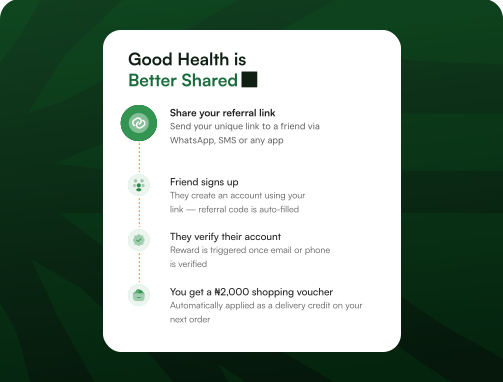
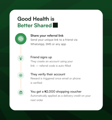
Referrals & Rewards
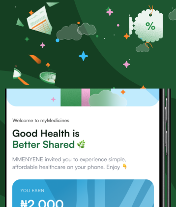
Users can seamlessly invite friends and family through a simple, delightful flow, earning rewards as they join and engage.
This creates a growing network effect, driving adoption through shared value and incentives.
BRAND EXPRESSION
Bringing the Brand to Life Across the Experience
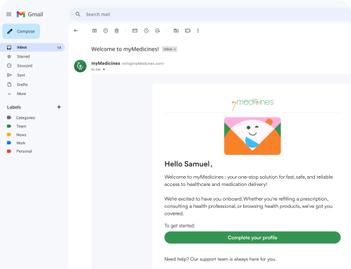
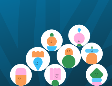
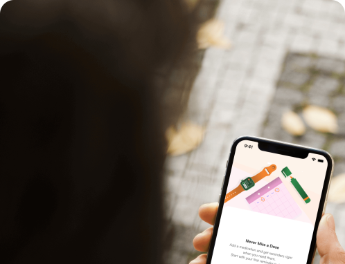
The brand was designed to feel clear, human, and approachable across every touchpoint.
We developed a cohesive visual language spanning illustrations, iconography, and interface elements, ensuring consistency while supporting usability.
From expressive empty states to functional UI assets, each element was crafted to reinforce trust and make the experience feel intuitive and engaging.



INTEGRATING AI
Intelligence in Care
As digital health continues to evolve, AI is becoming a key driver of more responsive and personalized care experiences. Globally, over 60% of health systems are exploring or integrating AI, yet adoption across African health platforms remains early, often limited to backend operations rather than user-facing experiences.
Recognizing this gap, we saw an opportunity to bring intelligence closer to the user. Instead of treating AI as a feature, we approached it as an enabler of better care, supporting decision–making, improving access, and simplifying everyday health interactions.
This led to the integration of AI across multiple touchpoints within the product, each designed to enhance how users engage with their health in a more intuitive and supportive way.
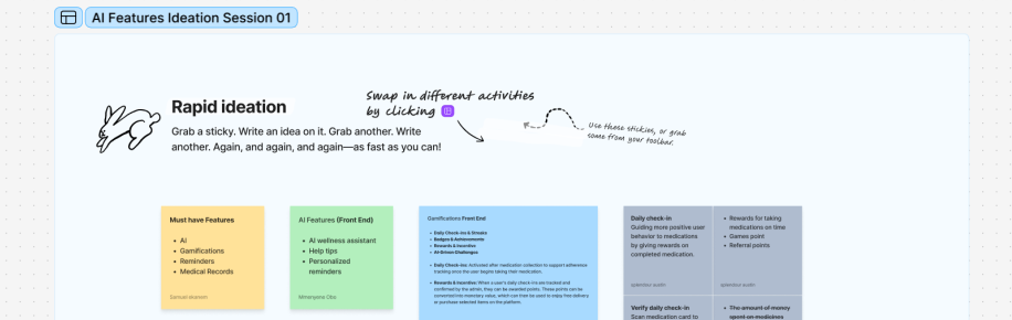
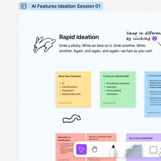
We explored early concepts through collaborative workshops, mapping out potential features, user interactions, and key touchpoints.
We also examined the technical requirements needed to support AI integration across the product.
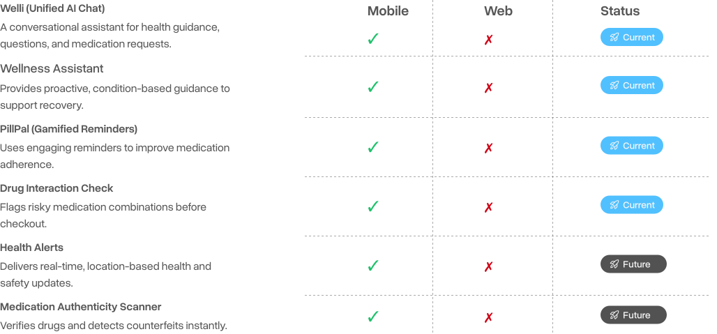
Feature Exploration & Rollout
This overview highlights what’s currently implemented and what’s planned for future iterations.
WELLI & WELLNESS ASSISTANT

Welli (Unified AI Chat)
We introduced WELLI as a conversational AI companion that helps users discover medications, answer everyday health questions, and know when it's time to speak with a pharmacist or doctor, all without leaving the app.

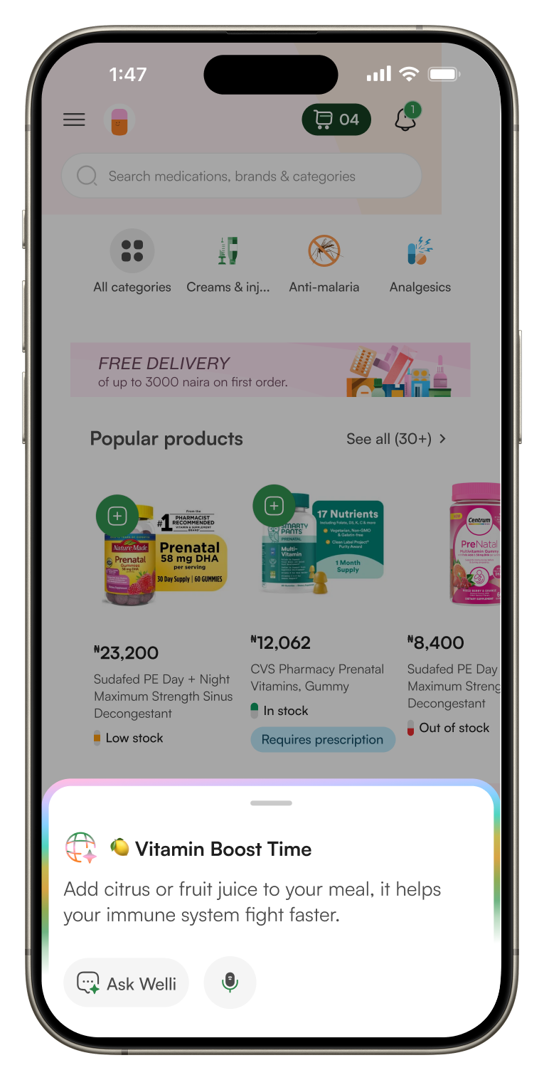
Wellness Assistant
The Wellness Assistant picks up where medication leaves off, sharing personalised wellness tips and healthy habits based on what users purchase, helping them build better routines alongside their treatment.
Payment Wallet
Making payments feel as seamless as care itself.
As MyMedicines evolved, we began looking beyond medication management to the entire healthcare journey, including how people pay for care. More products are adopting embedded, closed-loop wallets to reduce payment friction, improve convenience, reward customer loyalty, and keep essential services within a single experience. It creates value for both users, through faster, more rewarding payments, and businesses, through stronger engagement and retention clear.bank
In partnership with Sterling Bank, we introduced MyMedicines Wallet, a secure healthcare wallet designed for everyday medical spending. Users can fund their wallet once, pay seamlessly for medications and healthcare services, enjoy cashback and wallet-exclusive discounts, and set money aside for future health needs, all while laying the foundation for future features like wallet-to-wallet transfers.

Introducing the myMedicines wallet backed by Sterling Bank.
Pay for your medications with MyMedicines Wallet and enjoy up to 5% off every payment. Fast, secure, and rewarding.
- Checkout in seconds.
- Cash back and exclusive wallet offers.
- 5% off every payment.



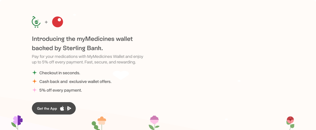
* My role was to translate the wallet into an experience that felt unmistakably MyMedicines, where branding, product, and usability came together without feeling like separate pieces.
WALLET FLOW

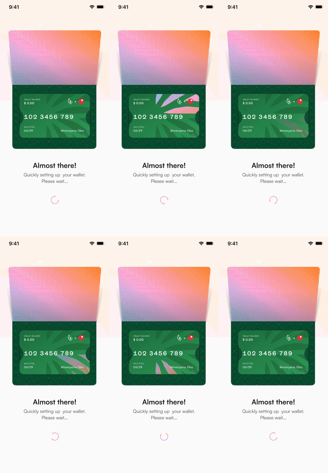
Quick Onboarding
Users can add and adjust products directly from the home screen, with a live cart indicator updating in real time. This seamless flow carries into checkout, enabling a quick, uninterrupted path from selection to payment.

Wallet
Users can add and adjust products directly from the home screen, with a live cart indicator updating in real time. This seamless flow carries into checkout, enabling a quick, uninterrupted path from selection to payment.
TESTING & FEEDBACK
Taking It Into the Real World
We moved from concept to real interactions, putting the product in front of users to see how it holds up in everyday scenarios. Through guided testing sessions, we observed how easily users could navigate, find medications, and complete key actions without friction. These sessions helped us identify gaps, validate assumptions, and refine the experience based on real behaviour, and not just intent.
What We Learned in the Real World
To deepen our understanding of how the product performs in real scenarios, we worked closely with the product team during testing sessions. I brought in Steve Mogbo, our Product Manager, to share key observations from these sessions and how they shaped our improvements.
“ Testing revealed three key areas where the product needed refinement.
First was ease of use. While the core experience was in place, we noticed users struggled with certain flows, particularly onboarding and navigation. This led us to introduce subtle guidance elements to help users move through the product more intuitively.
Second, we identified gaps in the overall user journey. Some steps felt redundant, while others created friction. By simplifying these flows, we were able to create a smoother and more cohesive experience.
Lastly, testing helped uncover functional issues, from minor bugs to actions not behaving as expected. Addressing these ensured the product performed reliably across key interactions.” Steve Mogbo — Product Manager
These insights directly informed a series of refinements across the product, helping us improve clarity, usability, and overall experience.
App Tour Guide
Introduced a guided walkthrough to help users quickly understand key features and navigate the app with ease.
Promo Badges
Added visible indicators to highlight available promos, ensuring users don't miss rewards during checkout.
IMPACT & REFLECTIONS
What We Learned — And What's Ahead
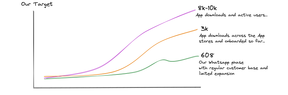
Though still in its early stages, the product has begun to meaningfully improve how users access and interact with medication. Since launch, we’ve onboarded a growing number of users, with engagement steadily increasing as more people transition from manual channels to a structured digital experience.
This shift has already reflected in performance, with sales seeing a notable increase compared to the same period when operations were primarily WhatsApp-based, validating both the need and the direction of the product.
Beyond individual users, the platform is expanding through strategic partnerships. We’ve onboarded Nomadoc, supporting access to quality healthcare for people just coming into the country, and AHID (Africa Hope for Innovation and Development) to enable discreet distribution of sexual health products. We’re also opening up APIs for external partners, positioning the platform as a scalable infrastructure for healthcare access across the region.
OFF THE SCREEN THOUGHTS
This project has been a deeply rewarding experience moving from early ideas to building a product that people can actually use. Exploring how AI can fit naturally into healthcare, while still keeping the experience simple and human, has been one of the most exciting parts of the journey.
It’s also made me more intentional about designing for accessibility and inclusivity. Health is universal, and the challenge is not just building features, but making them work for as many people as possible, across different contexts.
Looking ahead, there’s still a lot to explore; refining existing features, introducing more intelligent systems, and expanding access through stronger partnerships and distribution. The goal is to grow this beyond a product into something that can truly scale across Nigeria and, eventually, across Africa.
This project was shaped through collaboration, shared thinking, and a lot of intentional building.
A special thanks to Sam for leading design and engineering, and guiding key iterations.
To Steve for shaping a thoughtful, user-focused product direction.
To Josiah and Awwal for bringing the interface to life on the frontend.
To Deji and Prince for building and stabilizing the backend, and Franklin for managing infrastructure.
Grateful to everyone who contributed, this was a pleasure to build together.